


Pier Veenema 2023. SCHOOL PROJECT ---------------- VEENEMA_STUDIOS
_____
BURNING MAN NL
For my third schoolproject in my exam year, we had to create a new brand identity and introduction campaign for Burning Man NL. The goal was very simple: The experience of Burning Man can produce positive spiritual change in the world, and the brand Identity needs to have an analogue look and feel to it.
It was my first time designing an identity that had to have a more analogue look to it. At first I wasn't too positive about it, but looking back it was one of the most educative projects and some of my best work to date.
_____
_____
MANIFESTO
"We are not your ordinary festival or community. Burning man is a feeling... A spiritual awakening. Let go of everything you fear to lose and dive into the unknown"
We have become obsessed with status and materialism trying to chase an image of perfection. Burning Man is about facing this inner battle and transcending yourself into something more than just a "by-product of a lifestyle obsession".
_____


_____
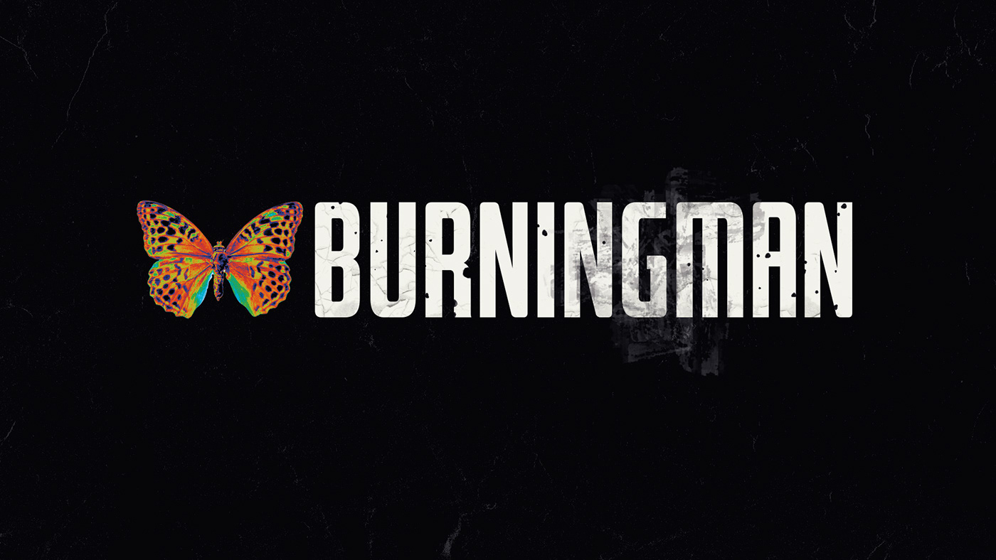
LOGO
For the logo and mascott I chose to use a Butterfly. It represents a symbol for the transformation and freedom Burning Man participants experience.
_____
_____
INSPIRATION
The movies Fight Club and The Game played a huge part in this project. These movies pretty much built the foundation for the concept behind Burning Man. Where other festivals just try to create a good time for everybody. Burning Man is trying to tell you something.
_____

_____
THE BURNING MAN COMMANDMENTS


LOGOFOLIO
Every big festival has sponsors... However, big corporations sponsoring a festival about anti materialism and anti consumerism seems hypocritical. So I decided to design a logofolio with "logo's" that send a message about what burning man is trying to achieve.
_____

_____
THANK YOU FOR WATCHING
___
PORTFOLIO
https://vpier29.wixsite.com/veenema-studios/
INSTAGRAM
https://www.instagram.com/
LINKEDIN
https://www.linkedin.com/in/pier-veenema-188a4720a/


